Blog Post #1 - Inspired Artist, 01/30/2019
|
|
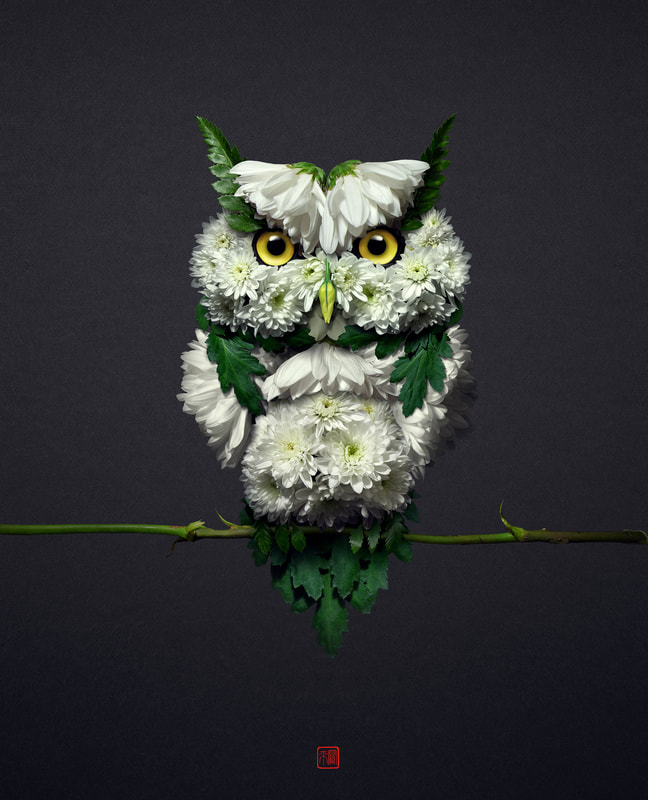
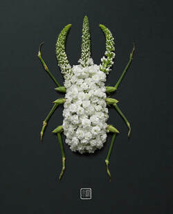
The artist in charge of these paintings is named Raku Inoue, and he is located in Montreal, Quebec, Canada. Inoue likes to experiment with multiple media but his works are usually based on polymer clay, digital photography and photoshop. His main challenege is, he says, is to keep on expanding my creativity. Just by scrolling through some of his pieces, I am really intrigued by some of his pieces. For example, the two pictures above are part of how flower petals and stems can transform into intricate shapes such as animals and insects. This is just one example, but I love the way Inoue uses his surroundings to create such beautiful ideas to make his art come alive. Who would've thought flower petals and stems can create what he has! Additionally, the detail that he is able to include with these pieces is extraordinary, and it shows the time and effort that he is putting into creating his art. Overall, a lot of Inoue's pieces seem to have a reoccuring theme of nature, which is also something I admire because I love nature and how its beauty makes our world even more beautiful as it is!
Social Media:
- https://www.instagram.com/reikan_creations/
- https://www.behance.net/rakuinoue
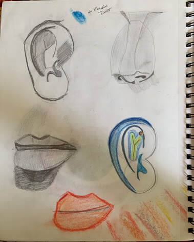
Blog Post #2 - Drawing Project One, 01/04/2019
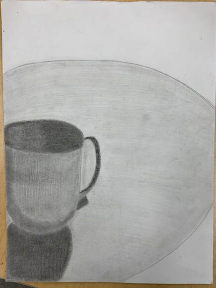
Pencil Drawing - Mug |
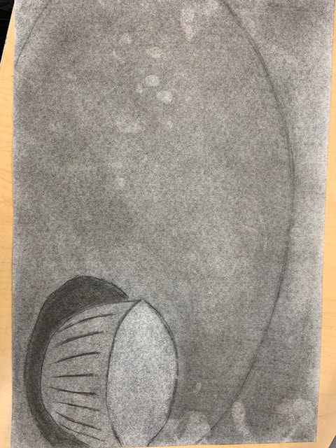
Charcoal Drawing - Bowl |
Pen Drawing - IN PROGRESS
|
Pen Drawing - Plate
|
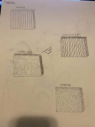
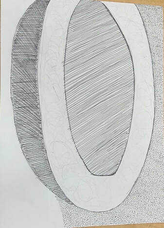
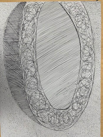
I think the most helpful warm-up for me was the pen cubes exercise we did! In previous art classes, we have learned all kind of techniques for drawing with pencils and even charcoal from time to time. But, drawing with pen with something very new to me! When I heard we would be doing pen art, I wasn't very confident on what I could accomplish, but with this warm-up I was able to practice and become comfortable with pen drawing. The hatching, cross-hatching, random line, and stippling methods were so interesting to learn about and I loved looking at art examples that include these techniques! With this practice, I was able to successfully complete by pen drawing, and I believe I had the most fun putting in my creativity and generating that piece. All in all, I really loved this warm-up and it really helped me learn more about how to draw using pens and become more confident in creating such pieces.
COMPOSITION: This is defined as the placement/arrangement of visual elements or ingredients in a work of art, as distinct from the subject of a work (the organization of elements of art according to the principles of art).
VALUE: This is defined as the element of design that defines light and darks in an artwork.
VALUE: This is defined as the element of design that defines light and darks in an artwork.
PROS and CONS:
Pencil - The pros of using pencil is how easy it is to use since we are used to the way a pencil works. Since it also has an eraser, when making mistakes, one can easily fix it by erasing and continuing to draw. Also, because of it small tip, it is useful for drawing really detailed objects/scenery. Cons include how it can be smudged easily and how the pencil needs to be continuously sharpened.
Pen - Using a pen for drawing includes pros such as how it is a bit smoother than using something like a pencil, it is darker in color, one can make cleaner lines, and more! Cons include how there is no eraser, which can be convenient when making little mistakes here and there, etc.
Charcoal - The pros with charcoal include how one can make large scale, rapid changes which allow an artist to explore and fix mistakes in shorter amounts of time. Additionally, when using techniques such as shadows, value, etc. charcoal makes an art piece really come to life. Although, some downsides include how it can tend to get messy and how it can be difficult to draw really small and precise details.
Blog Post #3 - Painting Warm Ups, 02/06/2019
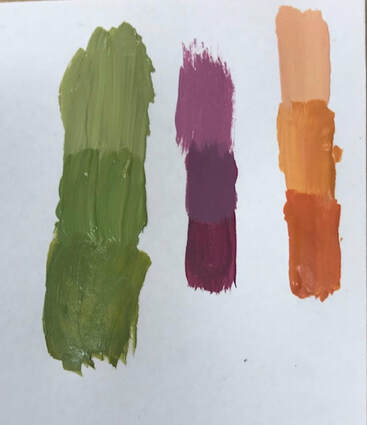
Color Matching - Green, Purple, Orange
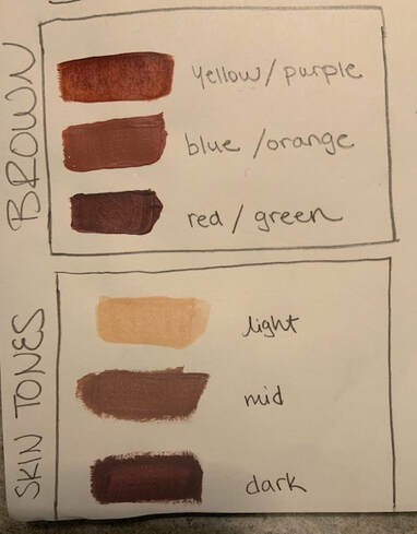
Mixing Brown & Skin Tones
|
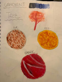
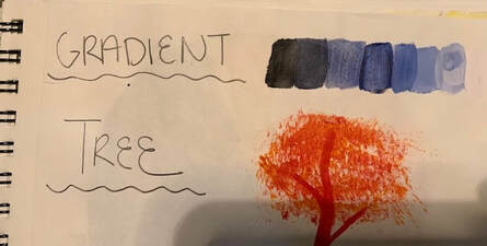
Gradient, Tree, & 3 Textures
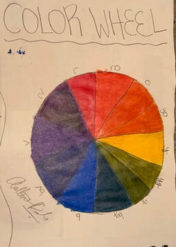
Color Wheel
|
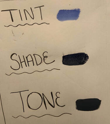
Tint/Shade/Tone
What did you learn from these activities?
From the variety of activities that we completed in class, I was able to learn a whole lot painting tips and techniques that I had never known! I am so glad that I got to learn these techniques as they can now help me with my project paintings, and whenever I may need to paint in the future, I can circle back to what I learned here! Some were more challenging than expected! For example, the color matching is actually much harder than it looks, and the shades of green were the most difficult for us to create, and even what we ended up with isn't completely correct! But, all in all, it was so much fun experimenting! |
Which one do you feel will be the most helpful for the painting you have planned?
For me, I believe that the tiny/shade/tone exercise will help me the most! I had learned from my interior design class back in 10th grade about how to make a tint, etc. But, doing it physically helped me visualize what I had in my head earlier as art in front of me.
Which one did you learn the most from either it was successful or not? Why is that?
I was able to learn the most from the color wheel that I made! Mixes of colors such as red-violet, blue-green, and yellow-orange were really interesting to experiment with! For example, after painting my orange triangle, I realized that in order to create yellow-orange I need to add more yellow to my mix rather than orange, and to create red-orange, I would have to add more red to the mix! Learning about these little techniques was so interesting!
What are some ways to make brown?
There are multiple ways to create brown and we experimented with these in class! One way to create brown is by mixing yellow and purple. This brown turned out to be more of a lighter brown shade. The second way to create brown was by mixing blue and orange, which created a more tannish colored brown that almost looked like the color of coffee. Lastly, the third way we created brown was by mixing red and green, and these two colors made a brown shade that was much darker than the other two mixtures we had.
How to do tone down a color?
Toning down a color means to make a certain color less strong or prominent than it already is. One way to tone down a color is by mixing in its complementary color (like adding purple to yellow). Also, for example, if I wanted to tone down blue paint that I had on my palette, I could also add more white into the mix in order to make it a more lighter/softer blue color (not as prominent).
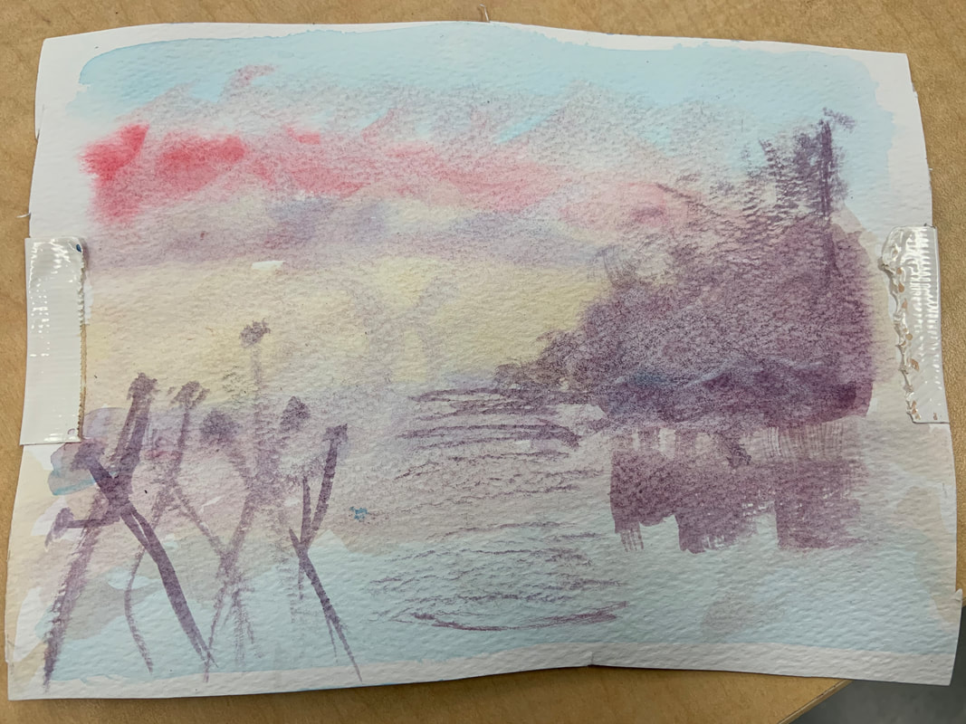
Blog Post #4 - The Idea of Place, 02/25/2019
Hue Value Scale
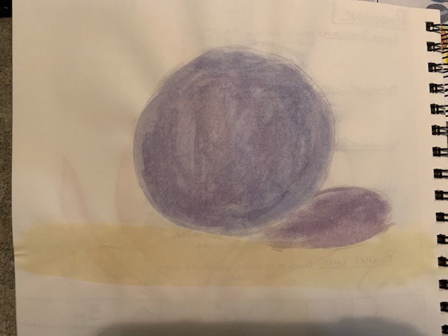
Favorite Warm-Up (Arcylic Sphere)
|
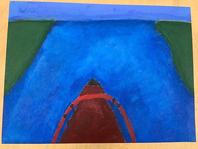
Finished Painting
What place is represented in your art? What is important about this place?
The place represented in my art piece is Kerala, India, which is a state located completely south. This place is very important to me as this is where both of my parents are originally from, and I get to visit every so often (every two years). I have a lot of extended family who lives there, and getting to visit them is the best thing ever. Although, not being able to see them as often can be very hard sometimes, and whenver I do go to India, I try and make it the best vacation it can possibly be. I am actually visitng them all this summer, which is why I wanted to dedicate this piece to Kerala. Specifically, this location is one of the many rivers in Kerala, with its very blue waters and houseboats and is just one aspect of Kerala's gorgeous beauty. |
What did you find most challenging about the picture you picked?
What I found the most challenging about the picture I picked was making the water look the way it looks in the picture. To begin with, I created a shade of blue that matched my picture, and painted the majority of the canvas with that color (for the portions of the canvas that were supposed to be water). Although, after taking to Ms. Rossi, she taught me cool ways to mix white and blue to make a variety of shades to add into the water! With these techniques, the water looked deeper in spots that it should be, and all in all, it helped the water look more realistic as a whole. This was definitely the most challenging part for me, but I was able to learn so much!
What I found the most challenging about the picture I picked was making the water look the way it looks in the picture. To begin with, I created a shade of blue that matched my picture, and painted the majority of the canvas with that color (for the portions of the canvas that were supposed to be water). Although, after taking to Ms. Rossi, she taught me cool ways to mix white and blue to make a variety of shades to add into the water! With these techniques, the water looked deeper in spots that it should be, and all in all, it helped the water look more realistic as a whole. This was definitely the most challenging part for me, but I was able to learn so much!
What do you feel is most successful about your piece?
One of the most successful things I feel my piece has is how realistic it is. With the texture of the water, the grass on the sides, the sky and the boat, it really helps depict what exactly is going on in the painting. At first, I wasn't completely sure that people would understand what I have drawn, but after our critiquing session in class, I learned that people were actually able to tell what I painted, which is always a good thing! I also love how personal it is to me as it portrays one of the most important locations of my life and it means the world. The painting shows only one example of the beauty that Kerala is, but hopefully I am able to connect with others like how I am connecting with myself.
One of the most successful things I feel my piece has is how realistic it is. With the texture of the water, the grass on the sides, the sky and the boat, it really helps depict what exactly is going on in the painting. At first, I wasn't completely sure that people would understand what I have drawn, but after our critiquing session in class, I learned that people were actually able to tell what I painted, which is always a good thing! I also love how personal it is to me as it portrays one of the most important locations of my life and it means the world. The painting shows only one example of the beauty that Kerala is, but hopefully I am able to connect with others like how I am connecting with myself.
Tell me about your process.
To start off, when given the choice of picking any location we wanted to paint, I contacted my cousin who is a photographer and asked for any pictures that he had of Kerala. He sent me a couple and this one automatically caught my eye as houseboats are one of my favorite things to go on! I started with canvas paper, primed it with a red color, and then began painting my piece. I started off my painting the front of the boat, then drawing out the sky for my two boundaries, and then I outlines the edges for where the grass lied and the rest I left blank for the water. I painted the boat and the sky first, and afterwards I painted the grass and the water, which I went over mulitple times with paint as both of these parts are almost the center of attention of my piece and this way, it looked more realistic. After everything dried, I took off the tape on the sides of my canvas paper (which I added to help make cleaner edges on my piece), and I ended up with my final painting!
To start off, when given the choice of picking any location we wanted to paint, I contacted my cousin who is a photographer and asked for any pictures that he had of Kerala. He sent me a couple and this one automatically caught my eye as houseboats are one of my favorite things to go on! I started with canvas paper, primed it with a red color, and then began painting my piece. I started off my painting the front of the boat, then drawing out the sky for my two boundaries, and then I outlines the edges for where the grass lied and the rest I left blank for the water. I painted the boat and the sky first, and afterwards I painted the grass and the water, which I went over mulitple times with paint as both of these parts are almost the center of attention of my piece and this way, it looked more realistic. After everything dried, I took off the tape on the sides of my canvas paper (which I added to help make cleaner edges on my piece), and I ended up with my final painting!
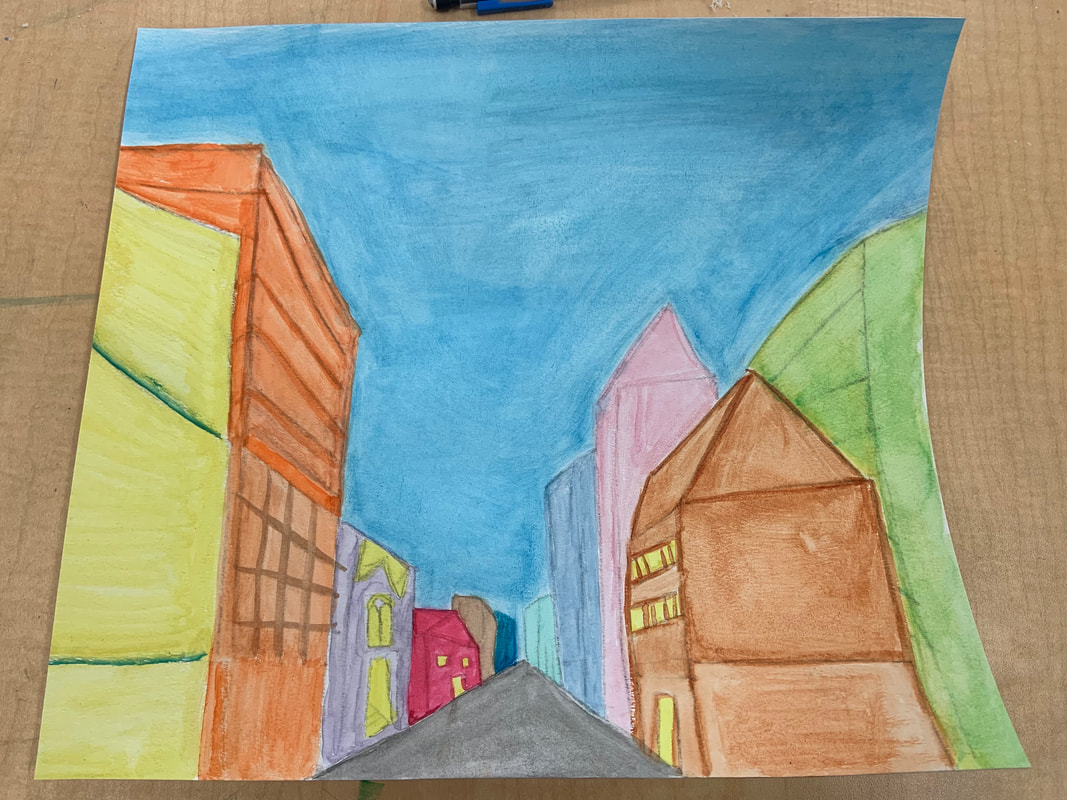
Blog Post #5 - Watercolor/Perspective, 03/10/2019
Piece in Progress
|
Piece Finished
|
Most Helpful Watercolor Warm-up
|

Most Helpful Perspective Warm-up
|
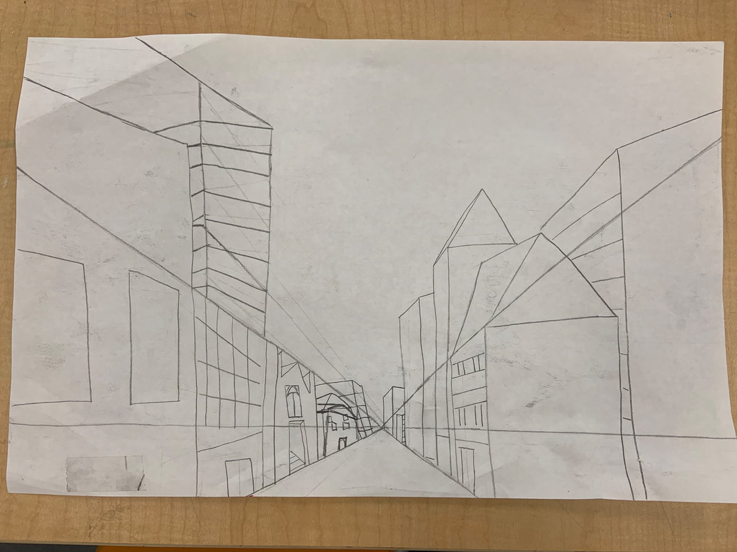
What perspective did you use? 1, 2, or 3?
For my painting, I used the the 1st perspective!
Tell me about the photo, where did you take it?
My painting is inspired by a beautiful picture that my cousin took, which I believe is the Brooklyn Bridge in New York City. I studied the perspective of the picture and athe detailing of the buildings and created my own version of a city scape for my painting! When starting the perspective unit, I automatically thought of this picture and asked my cousin to send it for me!
What did you find difficult about the project?
The most difficult thing for me about this project was how to handle watercolor and my brush control in general. I learned that a little bit of color and water goes a long way! It was sometimes hard not to lose patience when my brush ran out of color quickly, but it was all part of the experience and it was so much fun! It was also sometimes difficult to judge what brush would be more efficient for certain details, and I was able to learn the different ways to use these brushes.
How did the warm-up you picked help? Explain.
The warm-up I picked was the brush control warm-up. Before this class, I never had really painted much, so I was a little nervous when I learned that we were going to start doing watercolor paintings. So, for this reason, I believe the brush control warm-up helped me so much in that repeting certain designs over and over again gave me the practice needed to help me with my main project piece. It gave me a lot of control, which benefitted me when painting very distinct details. This is why I thought this warm-up was extremely helpful for me!
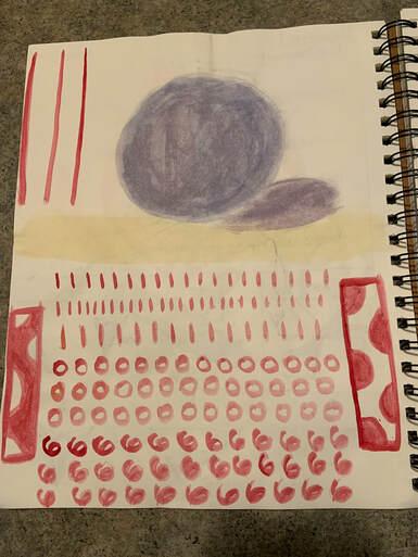
Blog Post #6 - Watercolor Warm-Ups, 03/11/2019

Brush Control Warm-up
|
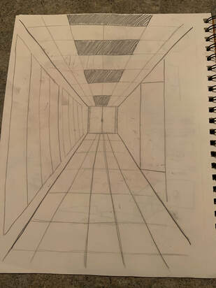
Hallway Sketch
|
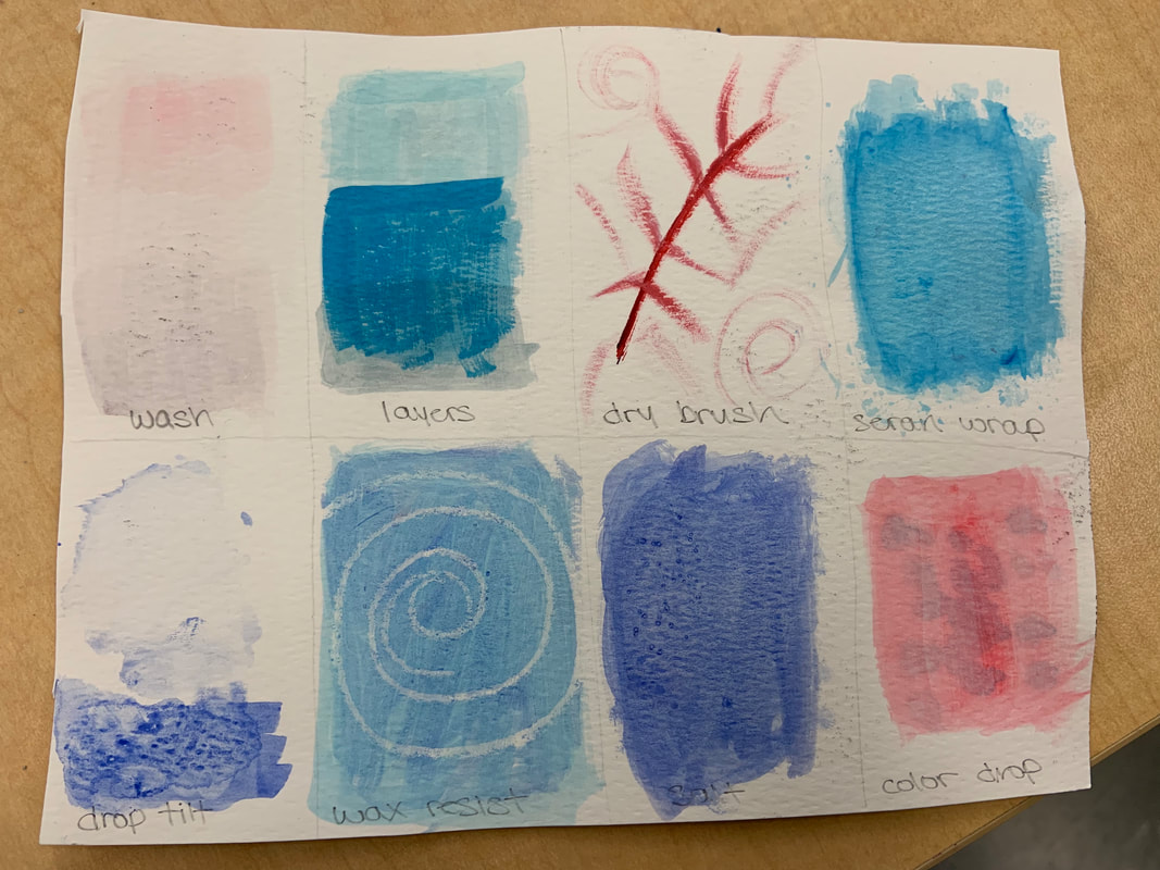
Watercolor Techniques Page
|
Sunset
|
Illustration from a child's book watercolor
|
What activity did you find most helpful or interesting in learning the process? I found the watercolor techniques activity that we did the most interesting! I never knew there were techniques such as "wax resist" and "color drop". I always thought there was one way to use watercolor and that was just to paint! Learning about the varity of techniques that there are, I got an insight on the different options that I have when it came to my watercolor painting. What do you like about watercolor? Watercolor is really fun! I really like how there are many different kinds of techniques that go into using watercolor and I love how anyone has the freedom to use any kind of technique they want that they bleieve will help their piece look the best that it can be. What do you find difficult about watercolor? The most difficult thing for me about watercolor was mainly my brush control. I learned that a little bit of color and water goes a long way! It was sometimes hard not to lose patience when my brush ran out of color quickly, but it was all part of the experience! |
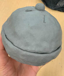
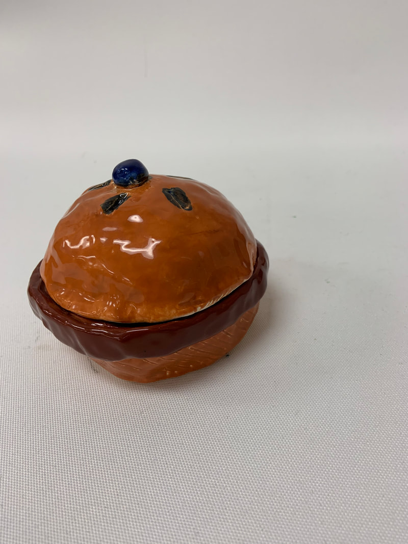
Blog Post #7 - Sculpture Vessel (In Progress) Post, 03/17/2019
- What do you plan to do with your piece? How do you plan to finish it? (3 sentences minimum)
- When my piece is fully completed, I plan to use it as a jewelry container for my earrings, rings, and even my necklaces! I plan to finish it by putting it through the first firing process, painting it with either glaze or acrylic paint (which I haven't completely decided yet), and then put it in for the final firing! Using the techniques and tips learned in class, I am ready to continue on with the final creation of this project!
- What things have you found difficult so far? How were they difficult?
- So far, I have found it difficult get used to the variety of clay tools that we have been provided with. Knowing which tool to use for certain aspects of creating my piece was difficult for me. Although, with these couple days of work, I have been able to get used to the tools and I even know the names of each!
What do you find successful so far?
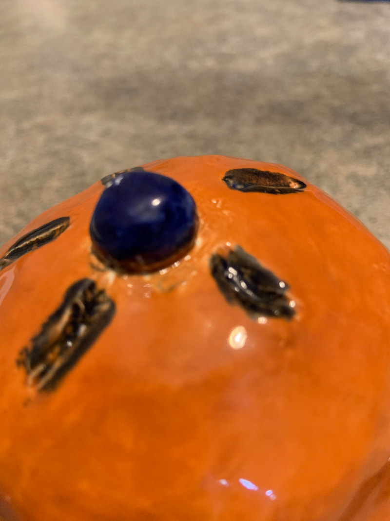
So far, I have found success in the creation of the appropriate shape and texture of my piece. I started off thinking to create a normal pot with nature-like designs on the side. Although, after creating my lid, I realized that my piece looked more like a pie! After this realization, I added some creases for the "pie" effect and even a little blueberry on top!
Explain your process up to this point. Use vocabulary: slab, scratch and slip, greenware, bisque, fire. (3 sentence minimum)
So far, I started off my project by obtaining a reasonable amount of clay to make the main base of my pot. After getting my sketch approved, I decided that a pinch pot would be the best option for what I wanted to create. I took my clay, and started pinching the ends and created a pot! Unfortunately, it was too small and I had to add more and more clay until the size was good enough to be a pot! Then, I took the rib tool and smoothened out the inside, outside, and edges of my pot! Next, I took the ribbon tool and created diagonal lines on the base to give it a "pie-like" effect. Next, I took so more clay and made another pinch pot that would fit as the lid! After smoothening this out with the rib tool once again, I took the ribbon tool and created four symmetrical creases on the top of the lid which is what pies have on them! Finalle, I created a small clay ball for the blueberyy on top of my pie, and in order to attach this properly, I used the sratching and scoring method by using the scratching scraper and water to carefully add my bluberry on top! Now, my piece in the kiln room, ready for firing!
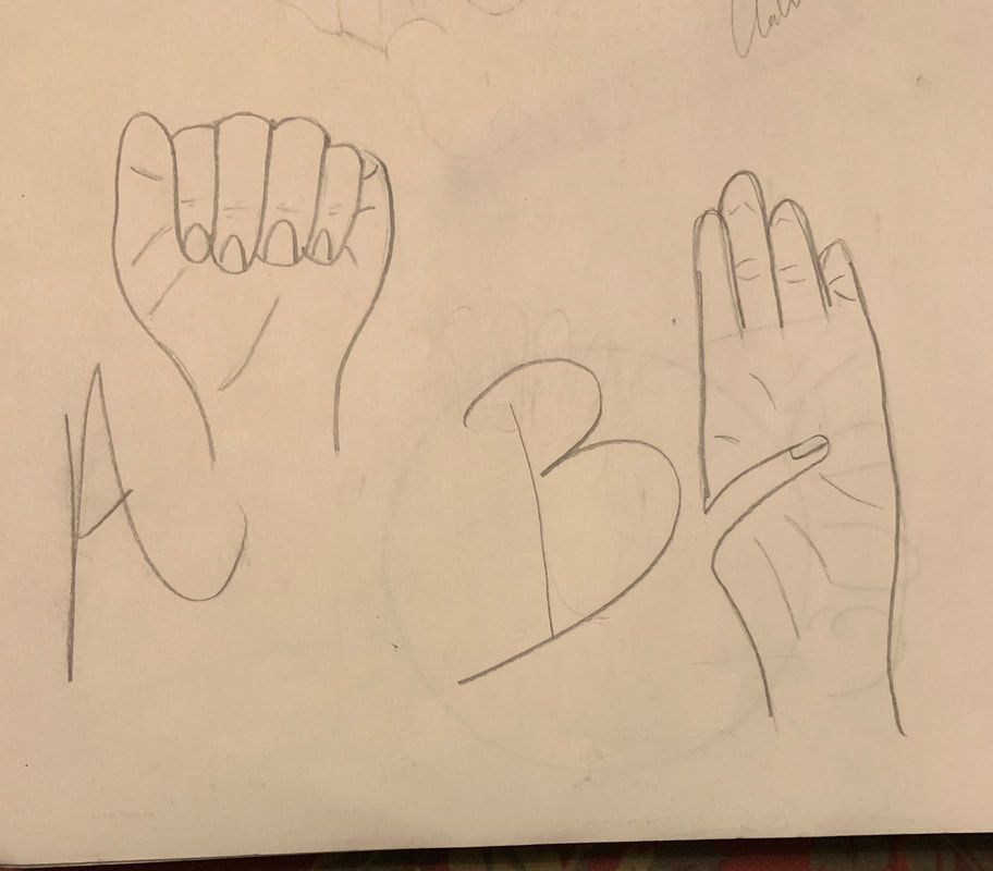
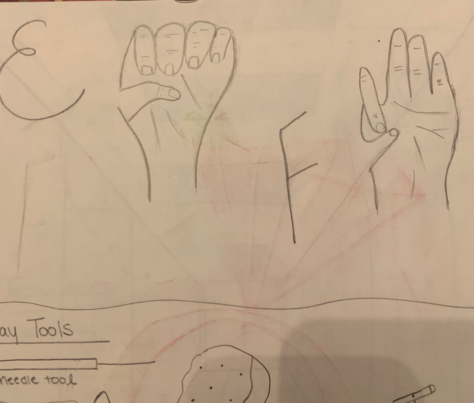
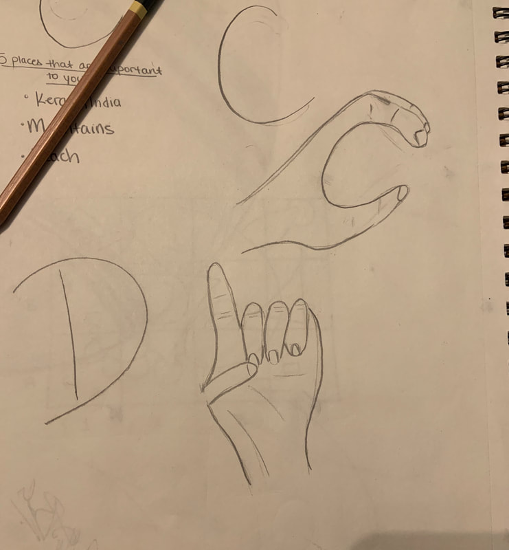
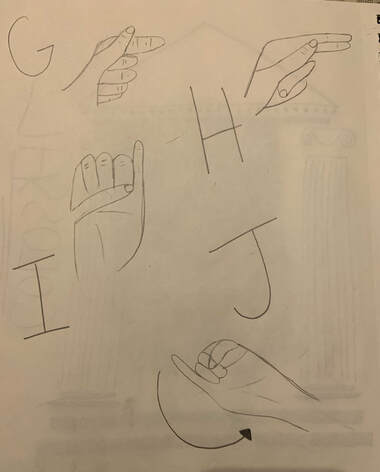
Blog Post #8 - Sign Language (A-J) Post, 03/26/2019
|
|
Blog Post #9 - Linocut Printmaking Post, 04/08/2019
Sketch
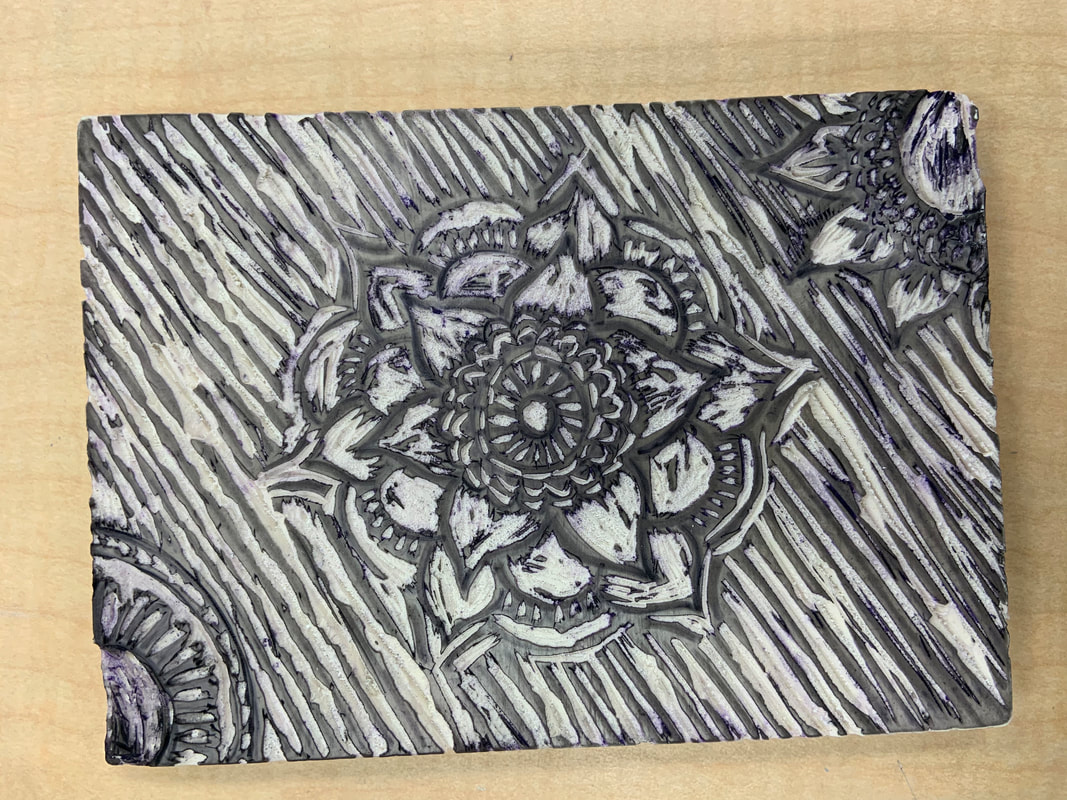
Linoleum block
|
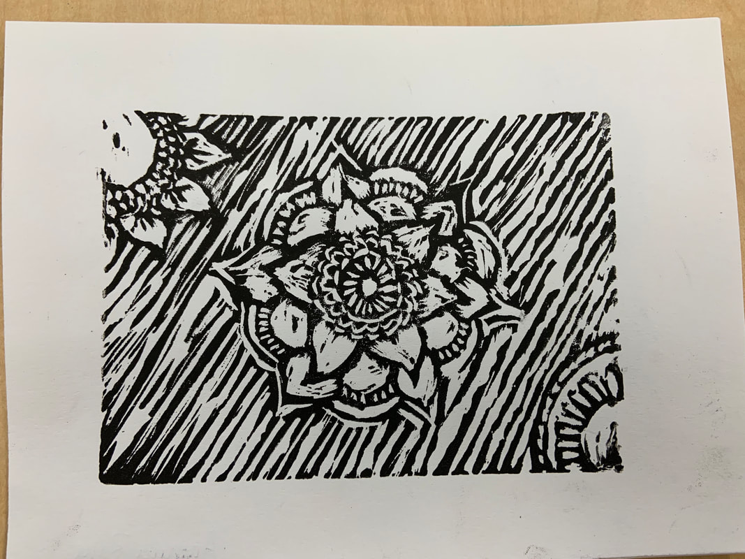
Finished best print
How does your piece show off the theme of "line?" My piece shows the theme of "line" as I have created a variety of patterns in my flower that include small and big lines, and the entire background of my linoleum block is patterned with diagonal lines that help to accentuate the flowers that I have carved out. Also, my flower doesn't just have straight lines, but it also has many curved lines as well. All in all, my entire piece is filled with lined patterns, therefore successfully fulfilling the "line" theme that we were assigned for this project. How is your piece successful and what might you change if you were to do it again? (3 sentences) My piece is successful due to the amount of lines I was able to incorporate in my piece, and also, to beign with I thought my design would be too complicated for this project. Although, I was able to take my time and cut the linoleum in slow and meticulous ways, which helped my final prints turn out way beter than I expected! If I were to do it again, I would maybe make my lines a little more cleaner, and when it came to rolling on the paint, I would maybe try and add multiple colors and add a gradient effect to the design! |
Blog Post #10 - Sculpture Vessel (Finished) Post, 04/28/2019
|
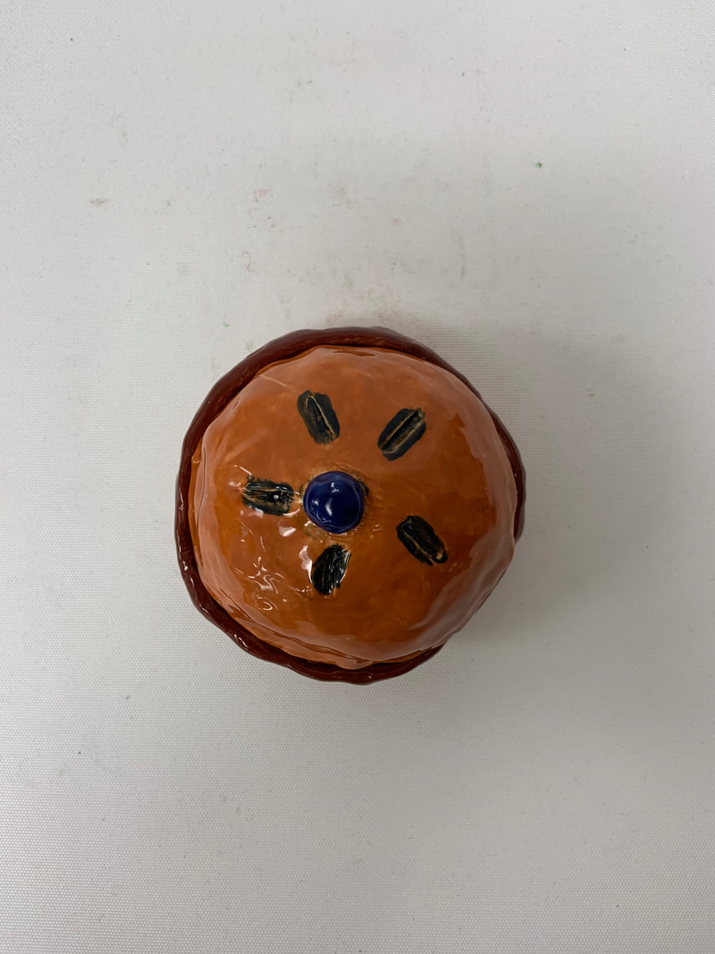
Since completing the in-process blog post what has been your process since? Use vocabulary: glaze, paint, glazeware, finish, and fire. Since my in-process blog post, my piece came out of the kiln looking just like it did before going into the kiln, except with a white finished look. From here I continued on with the glaze and picked out two shades of brown for the main body of the pie and a somewhat dark blue for the inside of my pie and the bluberry on top! After painting the whole thing, it went back into the kiln room for the second round of firing, and when it came out, the colors really came to life and my pie was super smooth and shiny! What do you find successful about the finished piece? What I find successful is the way I was able to sculpt my piece. Even after being told the pinch pot was one of the easier techniques for sculpting, I was a bit nervous on how the final shape of pot would end up looking like, but after taking enough time and being patient with my work, I was able to create a reasonable looking pie! I also think the way the colors turned out on the final product look very realistic as well! What would you have changed if you were to do it again? If I were to do it again, I would have repainted the inside portion of the bottom of my pie as the blue was a little absent in certain areas and I feel as though if I repainted it maybe two or three times, the blue would have been more prominent. Also, I may have taken a bit more time sculpting my pie as there are certain areas that look a bit messy. But overall, I think my pie turned out pretty well! |
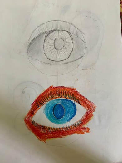
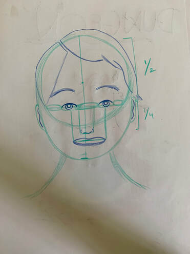
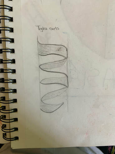
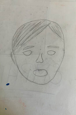
Blog Post #11 - Portraits, Warm-up Post, 05/04/2019
|
What warm up is proving to be the most helpful so far in your portrait piece? Explain.
I think that the warm up that helped me the most was the facial proportions warm up. This is because it gave me an idea about how everyone's face is shaped in its own unique and different way. I was able to learn how the distance between the eyes and how much the smile ranges, etc. all comes together to create a certain face shape, and how facial attributes like these are what help artists draw professional portrais of people and of themselves. What did you find most surprising about the facial proportions and why? What I found the most interesting is again, how everyone's face has certain proportions that make up the way they look. I was very interested to know that the forehead up until the bottom of the nose takes up about 1/2 of one's face and how the rest take up a 1/4! I never knew this! When we were first assigned with this project and I realized we had to draw portraits, I was so incredibly nervous, because I had no idea to approach such a thing! But, after learning about proportions and measurements that the face has, it became much easier to think about and try out! |
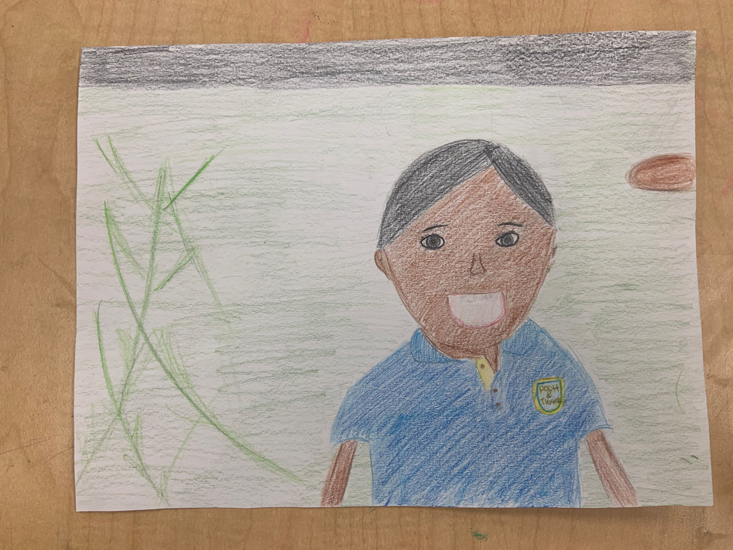
Blog Post #12 - Portraits Blog Post, 05/04/2019
|
|
Who did you do a portrait of? What is your relationship to them?
I did a portrait of my brother! He is actually 14 years old now, but this picture was taken in front of our house in 2009 when he was only 5 years old!
What medium did you use?
The medium I used for my portrait were prisma colors!
Explain your process start to finish.
My portrait process started off with me practicing some of the facial structure techniques we were taught in class! After practicing those some more, I took a sheet in my sketchbook and drew a very rough outline of my brother's face, just to get an idea of the proportions of his face. After doing this, I took a piece of paper for the final drawing! I first drew with pencil his face, body, and his clothes. After this, I envisioned and outlined what was needed for the background of this picture, which included the plants, grass, and the road. After everything was outlined, I took the necessary prisma colors provided in the classroom and I colored everything in based on the picture!
What do you find successful and what might you change if you were to complete it again?
What I found successful is how his face and the background came together really well in the end, which I was a bit nervous about in the beginning as I had never done a portrait like this in my life! If I were to complete this portrait again, I would add some more detail in his clothing and maybe a bit more depth into some of his facial structures like his eyes and nose.
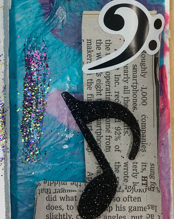
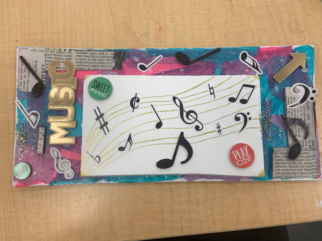
Blog Post #13 - Mixed Media Art, 05/11/2019
|
|
How many different mediums and techniques did you use? Describe each one of them.
Altogether, I ended up using 6 different mediums for my piece! The very first one I used was tissue paper, where I used colored tissue paper (blue, purple, and pink) with elmer's glue to stick all over my small piece of cardboard. After this I decided to decorate the corners of my cardboard with newspaper pieces for an enhancement of my piece. The third medium I used was the white painted cardboard piece I added into the middle of the board. My fourth medium was the gold pen I used on top of the white cardboard piece in the middle to create the musical staff for the stickers I would add later on. Next, I used musical note pop-up and regular stickers on the sides of my full board and on the golden penned music staff. Sixthly, and lastly, the final medium I used was a bit of glitter on the white cardboard piece in the middle and along the sides of the full board for a nice finishing touch.
What was your word and how did you portray it?
Out of the two selections I chose, I decided to use the piece of paper that read, "What makes you who are?". Music plays a huge role in my life as I have been dancing, singing, and playing piano every since I was a little girl. These are my biggest passions and truly us what makes me who I am today. Dancing, singing, and playing piano all include music, which is why I decided to make the main focus of my piece musical notes on a staff, which helps bring all of my passions into one representation. The biggest way I helped portray this was by drawing a musical staff and adding stickers that correlated with music, such as the music notes and extra pop-up stickers that fit into the same category. I really feel as though this piece really describes how important a role music plays in my day-today activities and how it makes my life really colorful and enjoyable at the same time!
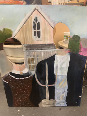
Blog Post #14 - Pop-Up Art Show, 05/28/2019
|
Pros:
Process: We started off by cutting off a large piece of canvas paper and we primed the entire space with the help of our table mates. Next, we took a pencil and outlined the background figures of the painting as well as the main two humans (the farmer and his sister). After outlining everything out, we took out all the paint colors we needed and mixed to make certain shades and tones that matched the original painting. After painting everything and letting it dry, we took cardboard and glued our painting onto it, and then we created a small stand so the entire structure could stand upright. Finally, we took cardboard cutters and scissors to cleanly cut out the circular head shapes of the people in our painting. Afterwards, we were ready to display our entire piece at the art show! |
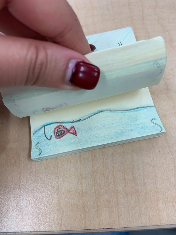
Blog Post #15 - Last Project (Flip-book), 05/30/2019
|
Pros:
Process: I started off by deciding a story line, and the story I chose was to focus on a little fish living in the ocean and how it was enjoying life and swimming around, but then down comes a hook and it becomes really curious. It keeps swimming towards it to see if anything will happen and it keeps doing this over and over until it loses patience and ends up grabbing onto the hook! It gets pulled out of the water and then the scene focuses on the next fish victim, and it ends with a cliffhanger! After deciding this, I outlined every page with the different scenes, and finally, after finishing this, I went through each page and colored it! It ended up turning out better than I expected!! |
